Thursday, November 4, 2010
Small World Munich - Website
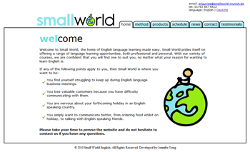
The final task was making the website for Small World. My client wanted it to look clean and cute, so I chose to use the same sky blue for the site as in the logo, keeping the site very minimalist and easy to navigate. I don't think the site will win any design awards, but I think the composition and white space is quite appealing, and at the end of the day not every site needs to be styled within an inch of its life! My client also chose to incorporate a German language option in the site, which may I add was not translated by myself :P
Small World Munich - Business Card
After selecting a logo, our next focus was on the business card. I had a good idea of what my client was looking for by now, having talked extensively about the feel of the company and its image. I produced two alternatives:
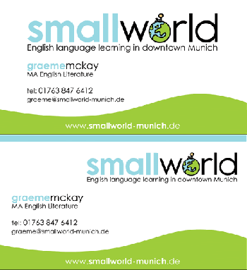
My client was pretty pleased with both, but opted for the second one. I tweaked it just a little:
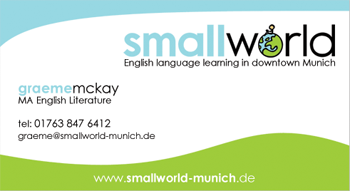

My client was pretty pleased with both, but opted for the second one. I tweaked it just a little:

SmallWorld Munich - logo, site & business card
Time for a long awaited update! I have been working on Small World Munich, an newly opened English teaching centre in Germany. The job involved designing the corporate logo, business card and website. My client wished to express the idea of a fun, relaxed and professional learning environment. He also wanted a simple, clean and friendly corporate ID.
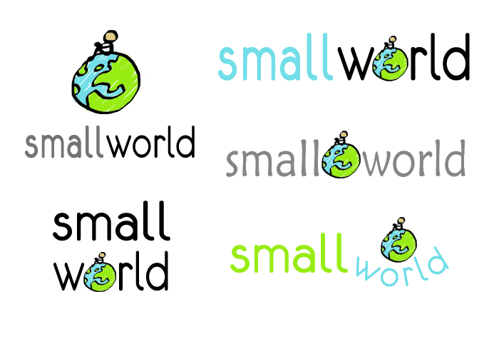
First off, we started work on the logo. My client already had a strong idea of what he wanted in his logo, a cartoonish globe with a figure reading on top of it - a concept which I was wary of at first, and tried to offer alternate solutions:
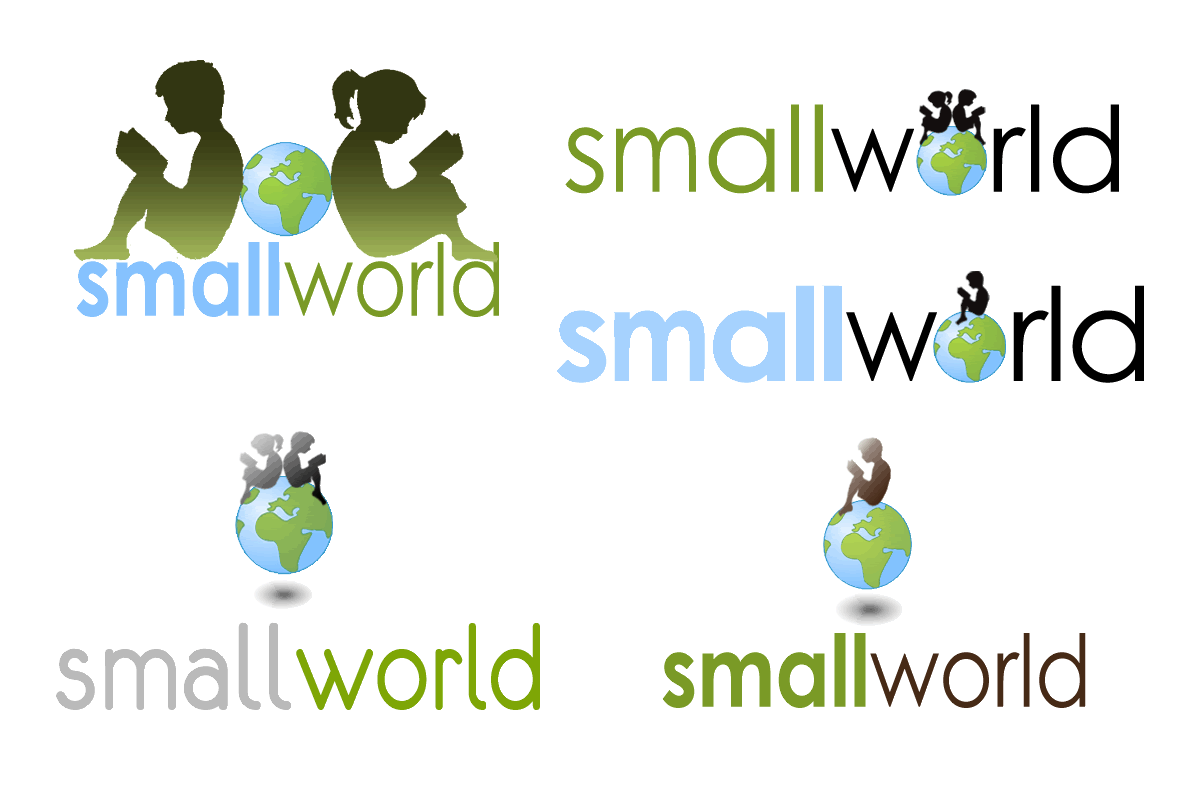
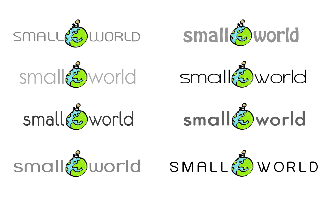
My client originally selected the composition in the third set of logos, but after some discussion, we mutually agreed that this composition was too centrally aligned and therefore lacked balance. Instead, I convinced my client to opt for the following solution:

I'm pretty happy with this decision - while I was working on the logos I initially felt convinced that the cartoony approach was not the best one to take, but now looking at the options, I feel the first set of logos were too serious and didn't convey any fun element at all. I am pretty pleased with the balance and colours (My client wanted bright blue and green) and the logo gave me a good base to work on the website having established an image for the company.
Subscribe to:
Posts (Atom)