this space is under deconstruction
Simpler is be clearer unless there is some soviet significance to the star? :) http://i40.tinypic.com/20sjdir.jpg
Yeah the star has been pissing me off too, just made another logo without it, will post in a sec! Thanks for the input!ps - star=theatre/performance? I am worried that without the star it looks like a moon, and then maybe we are selling pillows and pyjamas.
Post a Comment


2 comments:
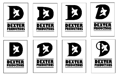
Simpler is be clearer unless there is some soviet significance to the star? :) http://i40.tinypic.com/20sjdir.jpg
Yeah the star has been pissing me off too, just made another logo without it, will post in a sec! Thanks for the input!
ps - star=theatre/performance? I am worried that without the star it looks like a moon, and then maybe we are selling pillows and pyjamas.
Post a Comment